|
|
Post by Jess on Dec 4, 2012 3:49:33 GMT -5
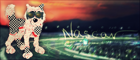
thepetzrus.webs.com/index.htmFiddling with the layout. I don't think the black in the links to the side and the welcome image at the top fit right in with everything else. Please only critique the layout and homepage - I havn't gotten to editing all of the other pages yet. As far as colors/etc/what do you think can be improved & what could look better? Even the smallest details help! <3 Thanks n_n
|
|
|
|
Post by Kay~ on Dec 4, 2012 3:54:11 GMT -5
I think it works pretty well. Idk, maybe the welcome image at the top needs to be a bit bigger? I think it's a bit small compared with everything else but other than that, it looks great!
|
|
|
|
Post by Jess on Dec 4, 2012 4:11:06 GMT -5
Thanks! If I make it much bigger, I think I'll put the links on the side closer together so that way it doesn't cause anything to scroll towards the bottom.
I agree that something looks maybe mis-proportioned or something, and maybe making the top bigger will help a bit. Plus then I can fit in some more lovies from my crew up there x3 <3
I edited the text a bit on the homepage, and I think it looks a bit cleaner now, heh.
Super pumped that I'm finally getting this done, lol.
|
|